
Background
In the last seven years, smartphones and tablets have revolutionized where we can look at data, what we can look for, and how we can look at the information we find because today’s “mobile devices” are digital companions with friendly user interfaces, fast micro‐processors , and long battery life. With a multitude of affordable applications, they now complement every aspects of our personal and professional lives.

Help Search Engines Find You
One of the biggest ranking factors for search engines is site quality. So an improved mobile search experience for your audience will help your site rank higher.
- A pleasant mobile web experience reduces bounce rates and increases time on site.
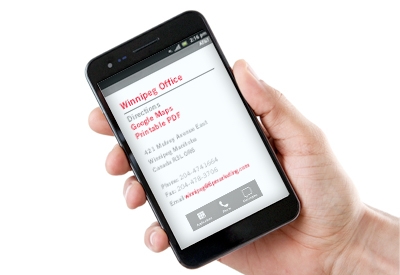
- Responsive sites also make it easy for smartphone users to see your site’s most important information: Your name, address, and phone number.
With a Responsive Site Design, Your Customers are just a Click Away From a Call or Directions to Your Business.
How Responsive Sites Work
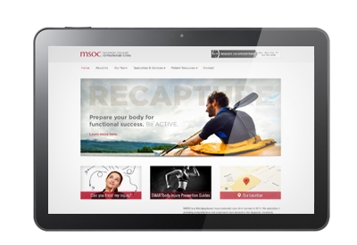
As the display size decreases from desktop to laptop to tablet and finally to a smartphone, each web page’s images and copy blocks are rearranged in an orderly manner for ease of viewing and reading.
Some (complex) content pages can be “turned off” and other (mobile only) elements can be “turned on”.
Can You Afford To Close Your Store One or Two Days A Week
In our experience, at least 17% of your web visitors receive a poor user experience. Websites that don’t work well on mobile devices are simply missing out on traffic conversion opportunities.
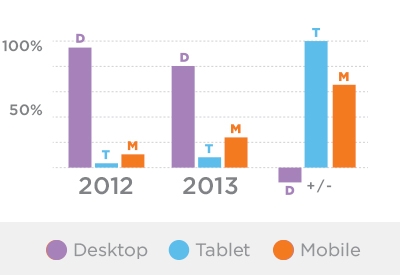
Companies that sell goods or services to young consumers will see high mobile traffic values on their websites while those that support mature employees who work at their desks (government services for example) will have lower mobile visit values. Tablet share of views are on the rise for all sites because tablets can be used for both personal and business related purposes.

How Do Your Numbers Look?
To the Right is a Typical Local B2B Device use data set.
On mobile browsers, the pictures, words, and links need to be large. If important information is not legible, visitors leave quickly and you may lose sales because they can’t see or respond to your offers.
*Please see your own site’s analytics for complete device data details or call 6P Marketing for help with understanding your analytics.
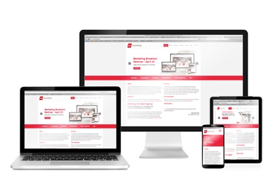
Check out our Latest Responsive Websites