Having just performed a refresh of Sigfusson’s brand and design standards, the 6P team applied new guidelines to great effect. The new design was cleaner, brighter, and much more modern thanks to greater use of the yellow of Sigfusson’s brand and gorgeous, expansive client-supplied photography. These design choices set Sigfusson’s website apart in an industry that prefers grunge and dark colours as a default.
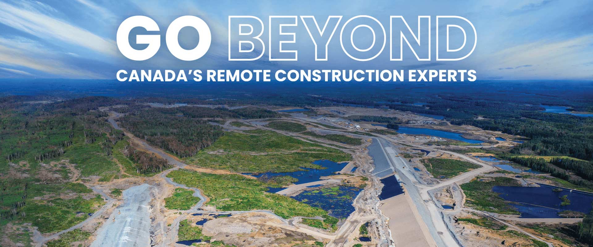
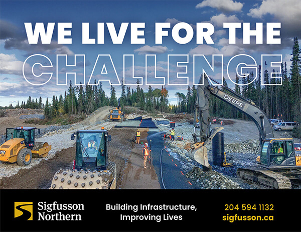
Still, Sigfusson’s website kept its edge. The photography, while beautiful, showed off the real, rugged northern landscapes where Sigfusson works as well as the company’s diversity of work and multifaceted nature. 6P took care to make sure these images were showed off as much as possible. New guidelines included the use of outline-only type for emphasis in headlines, allowing the photos to shine. Headlines were bold with confident lines like “Go Beyond” and “Challenge Accepted,” while subheads and body copy highlighted preparedness for anything, Sigfusson’s dedication to community, and more.
Changes were more than just visual. The new website featured a much-improved projects section to feature the company’s work, made searchable and filterable to make finding relevant projects as easy as possible. The section was set up to make adding and updating projects simple, with each page including a description and a custom image gallery. Finally, an equally cleaned up and enhanced careers section was also made searchable and filterable, with a form to apply directly from in each listing.